Rocco's
about the project
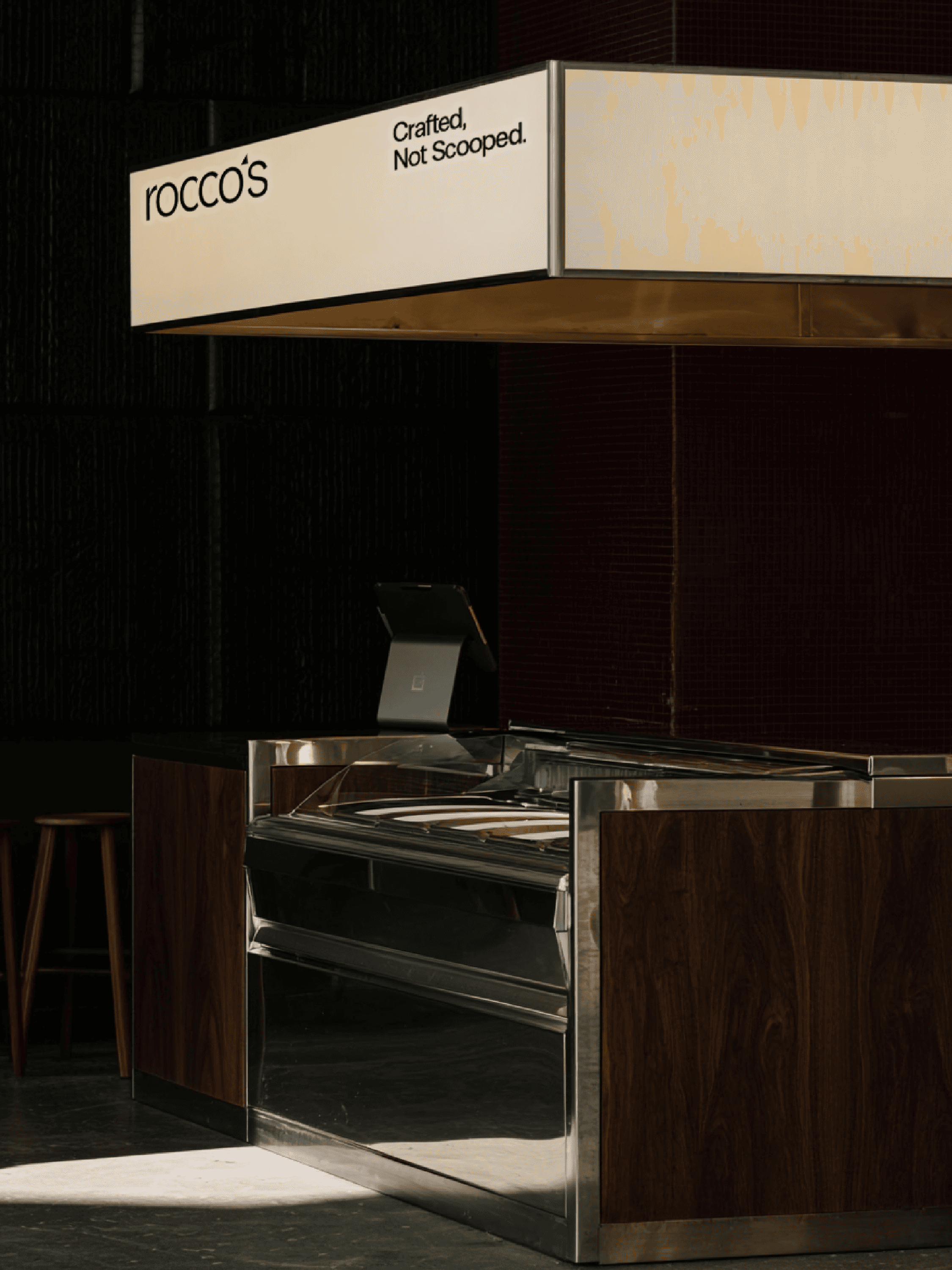
To position rocco’s as an authentic Italian gelateria, the strategy rejected the conventional "perfect scoop" aesthetic. The narrative, "Crafted, Not Scooped," anchored the identity in the physical truth of traditional gelato-making. Execution centered on a bespoke typographic system governed by two shapes: ▲ The Spatola Peak: An upward pull (the hero apostrophe). ▼ The Waffle Cone: An asymmetrical taper (the angled cuts). Coupled with restrained spacing reflecting a velvety texture, this geometric logotype anchored a comprehensive system. The identity seamlessly scaled across physical touchpoints—from textured packaging and loyalty cards to the gelateria's spatial concept—forming a premium brand experience.
Brand
Rocco's
Category
Brand Identity
year
2026